UI/UX- Platform Redesign
Beauty Retail Website
Redesigned a business platform to simplify invoice and e-way bill creation workflows for Admin, Standard, CA, and Trial users. Streamlined complex user journeys through research-driven design, resulting in improved task efficiency and user satisfaction.
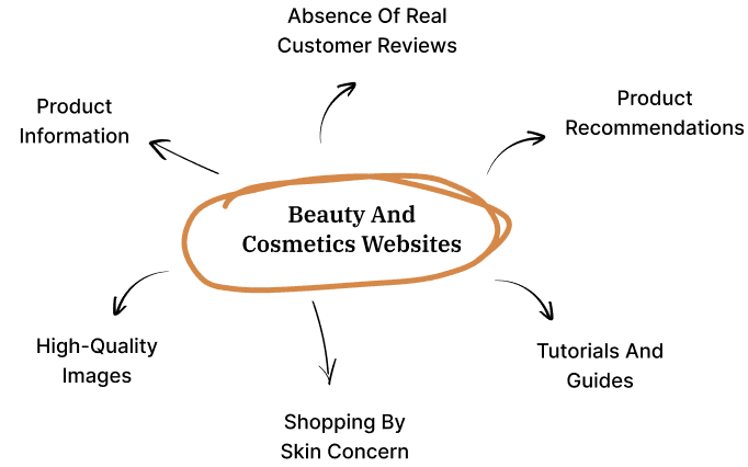
Beauty and cosmetics ecommerce platforms often struggle with generic user interfaces that look like standard WordPress templates. This basic design fails to showcase the brand's uniqueness, making it harder to engage customers and stand out in a competitive market.
Scope
Industry Led Live Project
Industry
E-Commerce
Duration
3 months
Tools
Figma, Useberry, Slack
Setting the Stage
Challenge
Challenge
Challenge
Beauty and cosmetics ecommerce platforms often struggle with generic user interfaces that look like standard WordPress templates. This basic design fails to showcase the brand's uniqueness, making it harder to engage customers and stand out in a competitive market.
Beauty and cosmetics ecommerce platforms often struggle with generic user interfaces that look like standard WordPress templates. This basic design fails to showcase the brand's uniqueness, making it harder to engage customers and stand out in a competitive market.
My Role
My Role
My Role
As a UX/UI Design Intern, I led UX research and design strategy within a 3-person team. I conducted field research and user interviews, collaborated directly with clients for requirements gathering, and spearheaded UI design direction while ensuring all decisions were grounded in user feedback and research insights.
As a UX/UI Design Intern, I led UX research and design strategy within a 3-person team. I conducted field research and user interviews, collaborated directly with clients for requirements gathering, and spearheaded UI design direction while ensuring all decisions were grounded in user feedback and research insights.
Solution
Solution
Solution
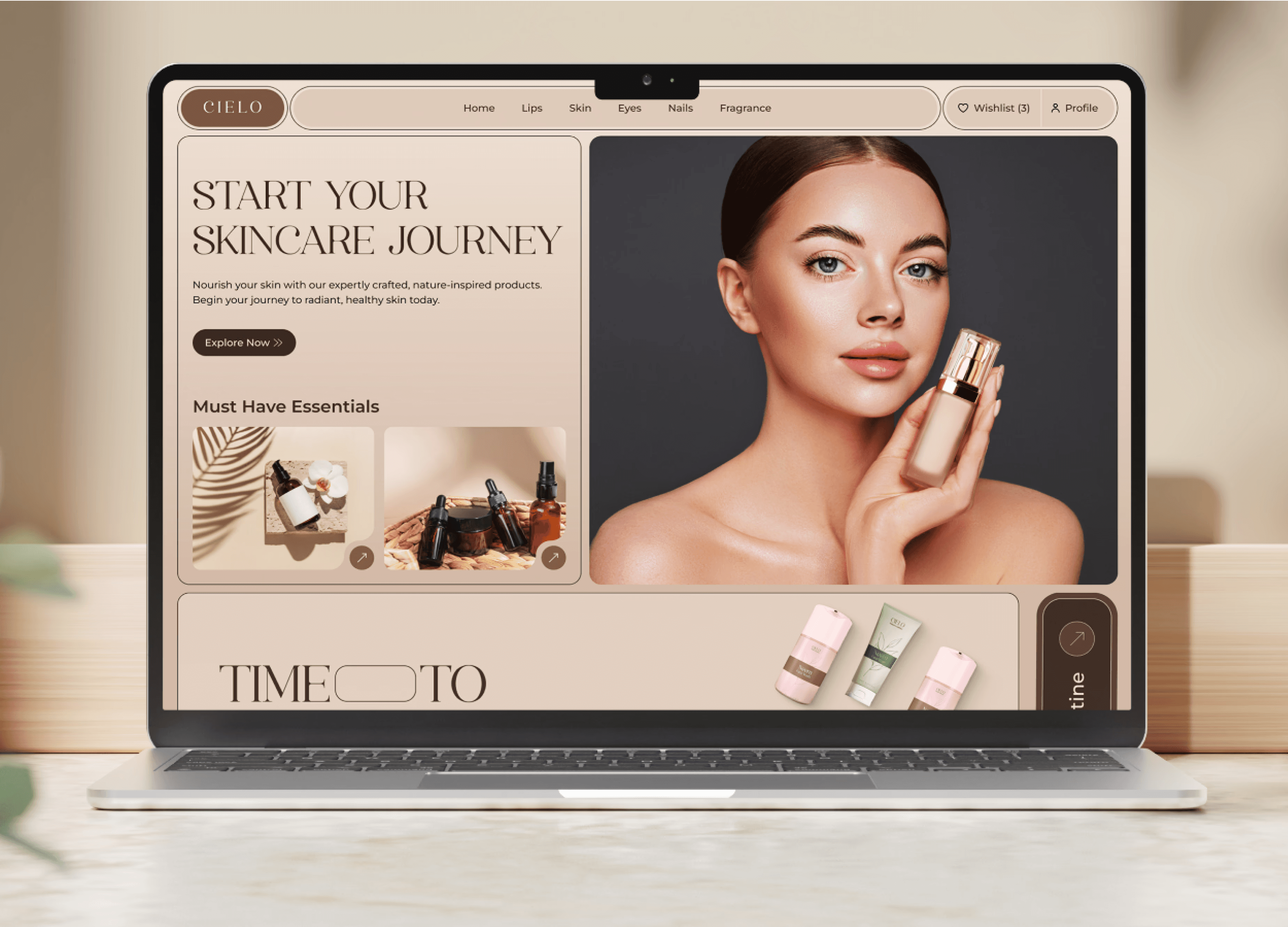
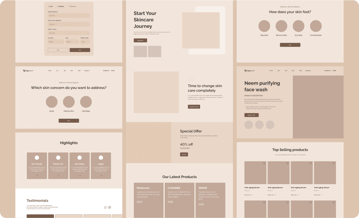
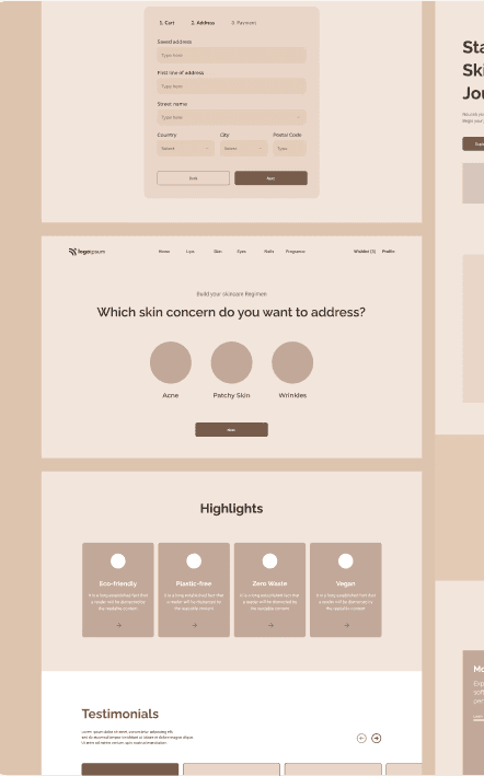
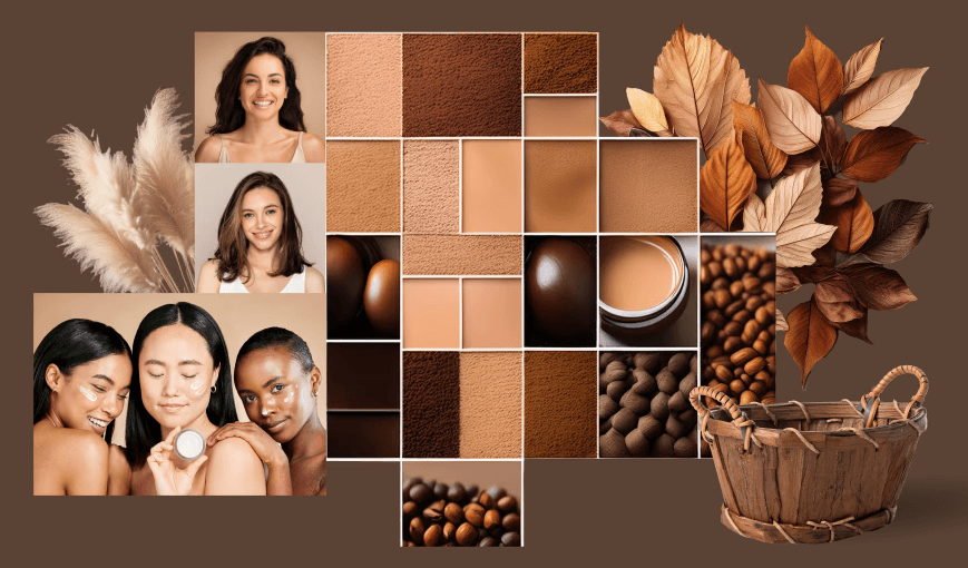
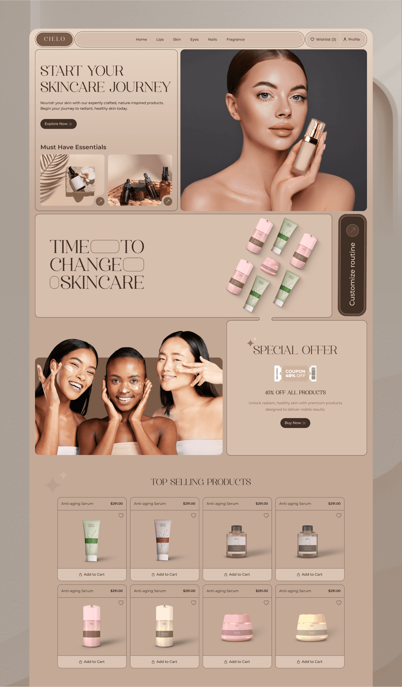
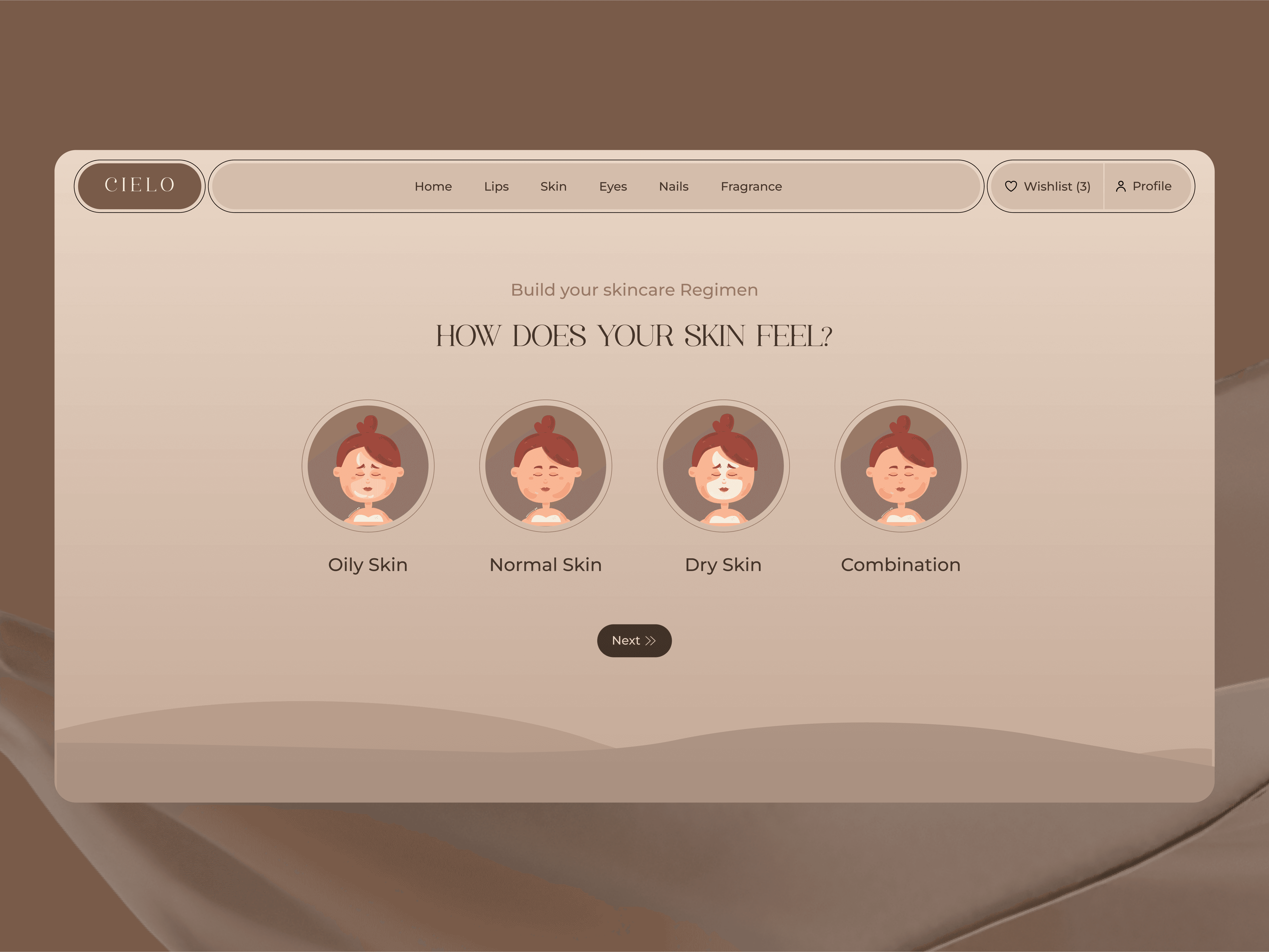
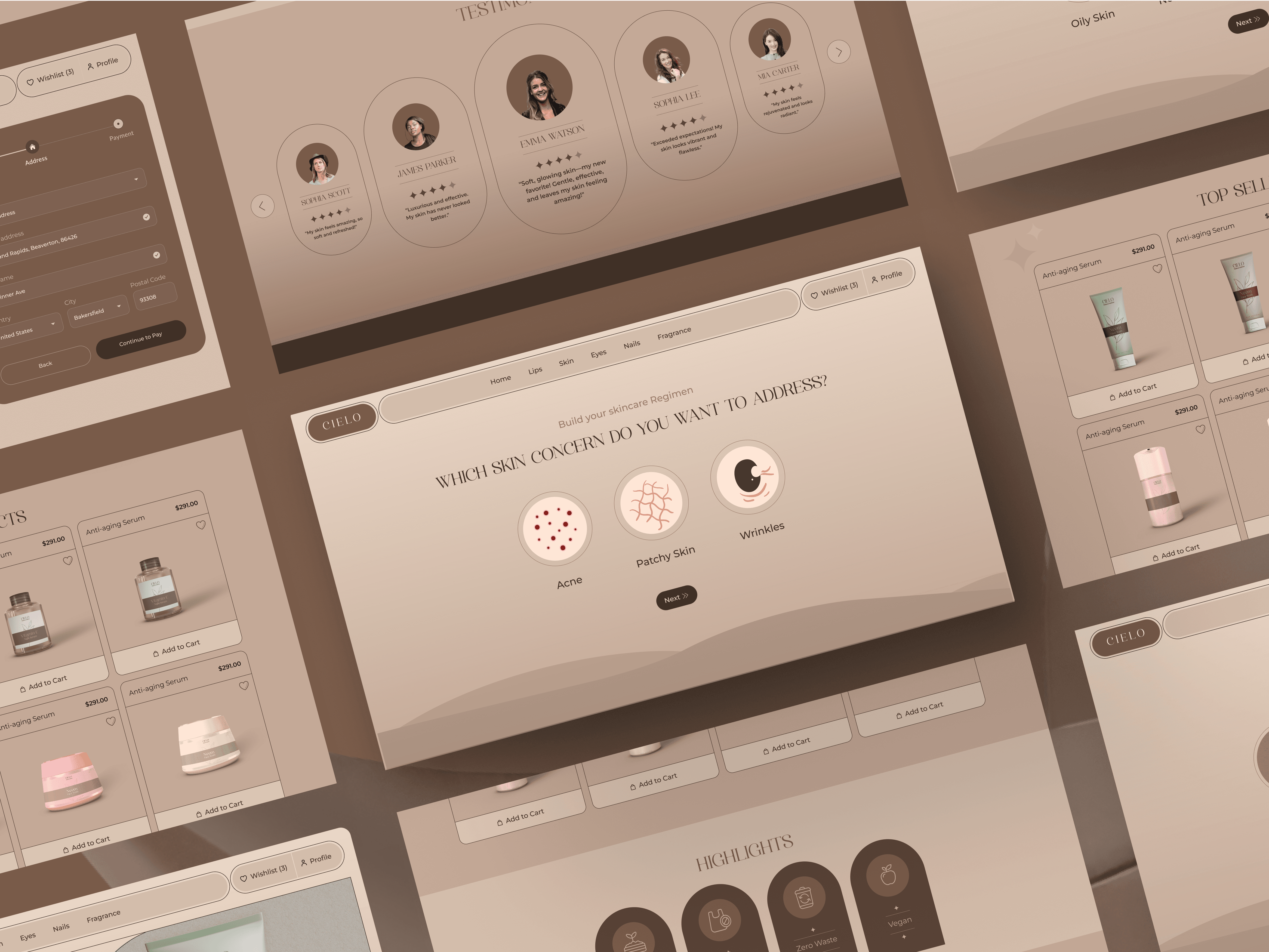
Since this product targets premium customers, we positioned it as a premium offering to evoke emotions of luxury and exclusivity. We ditched the basic look and gave the platform a fresh, modern look that reflected the website’s unique identity. The new layout featuring a clean and sophisticated interface ensured a smooth and enjoyable experience across all devices.
Since this product targets premium customers, we positioned it as a premium offering to evoke emotions of luxury and exclusivity. We ditched the basic look and gave the platform a fresh, modern look that reflected the website’s unique identity. The new layout featuring a clean and sophisticated interface ensured a smooth and enjoyable experience across all devices.
Lets Dig Into it
We conducted a survey, which laid the groundwork for our design process. We collected essential insights from our target audience, allowing us to create detailed user personas. This helped us understand their preferences, behaviors, and challenges, guiding our design decisions effectively.
On Field Research
User Interview
Insights
User Interview
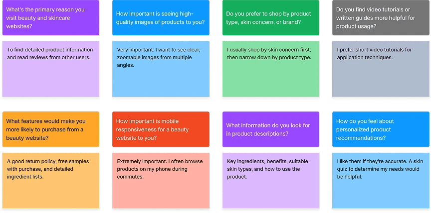
[02] Insights
Users were frustrated by unclear error messages and redundant form fields.
Mobile users struggled with small buttons and unresponsive layouts.
Trust the platform with her payment and personal information.
[02] Insights
Users were frustrated by unclear error messages and redundant form fields.
Mobile users struggled with small buttons and unresponsive layouts.
Trust the platform with her payment and personal information.
[04] Testing & Iteration
Conducted A/B testing with 500 users, comparing the original and redesigned flows.
Gathered feedback through usability testing and refined the design based on user input.
Designed a mobile-first layout with larger touch-friendly buttons and simplified navigation.
[04] Testing & Iteration
Conducted A/B testing with 500 users, comparing the original and redesigned flows.
Gathered feedback through usability testing and refined the design based on user input.
Designed a mobile-first layout with larger touch-friendly buttons and simplified navigation.
Connecting Dots
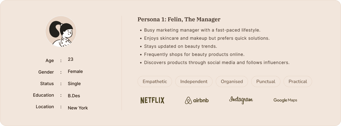
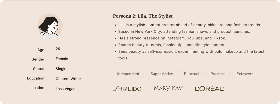
Jhon Roberts
Marketing Manager
Content
Age: 29
Location: New York City
Tech Proficiency: Moderate
Gender: Male
[Goal]
Quickly complete purchases without interruptions.
Trust the platform to handle her payment securely.
Access a seamless mobile shopping experience.
[Frustrations]
Long or confusing checkout processes.
Error messages that don’t explain the issue.
Poor mobile optimization that slows her down.
My Approach
Colour Selection
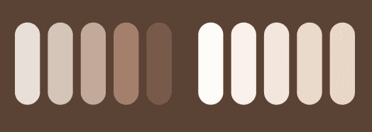
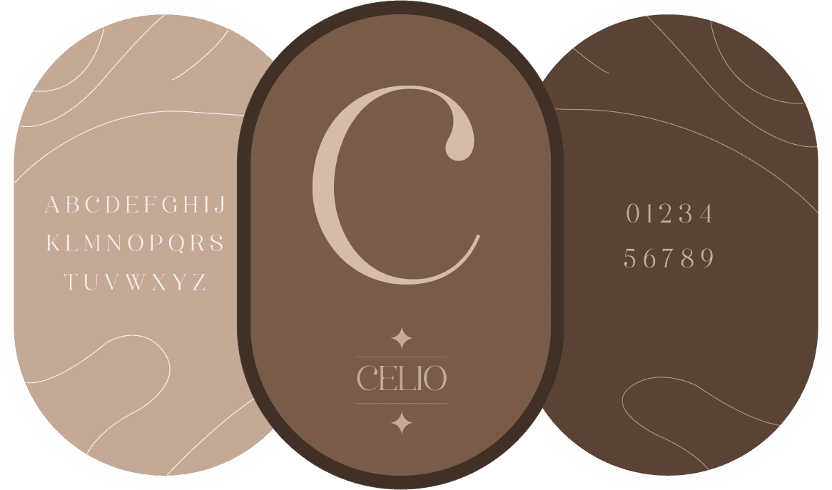
Picked a color palette that highlights luxury and sophistication, aligning with the premium feel of beauty and cosmetic products. These rich and elegant colors create a sense of luxury, enhancing the brand's upscale identity.
Iterative testing pays off
Human-Centered Approach
Highlighting necessary information
Regular testing uncovered hidden issues and ensured the design met user needs.
Designing experiences that prioritize user needs and behaviors.
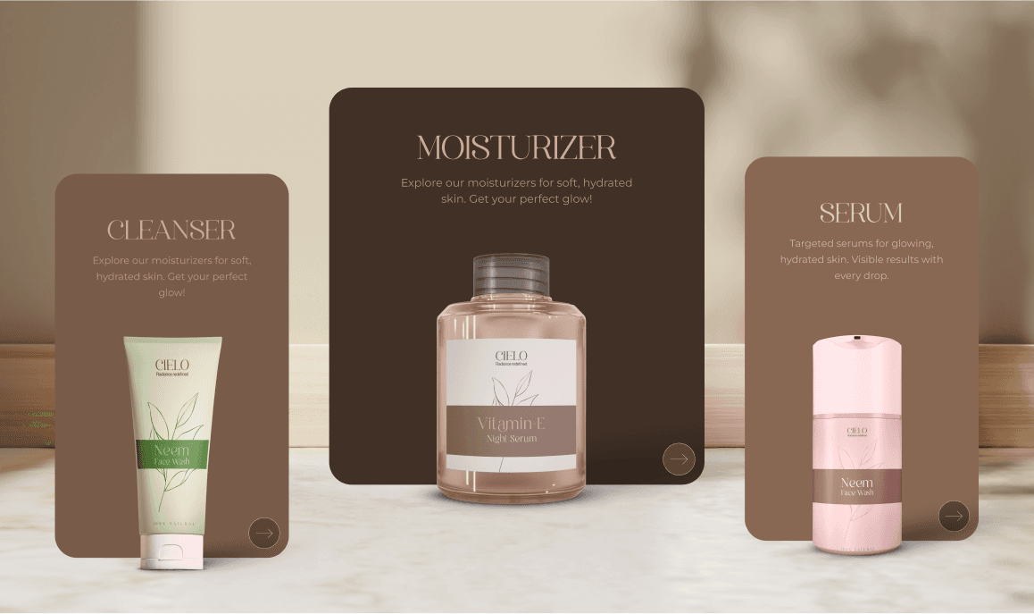
showcases all the essential sections, like discounts, key features, and top products, to effectively attract users. This layout helps visitors quickly find what they're looking for and keeps them engaged.
Details matter
Human-Centered Approach
Product feature page essentials
Small improvements, like error validation and mobile optimization, had a significant impact.
Designing experiences that prioritize user needs and behaviors.
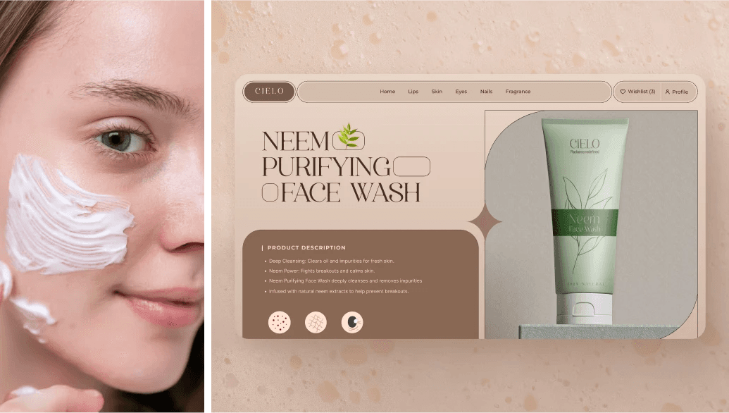
The product's single page features detailed information, high-quality images, and user reviews for each item. This design helps customers easily find the information they need to make informed purchasing decisions.
Sitemap
Mindmapping
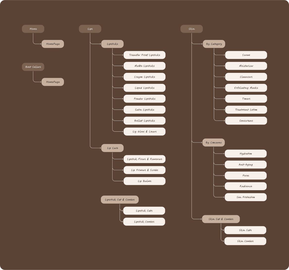
Sitemap
Sketching the Vision
Setting the Vibe
Lets Execute the Thought
Product Cards
Product Cards
Product single page
Product Cards
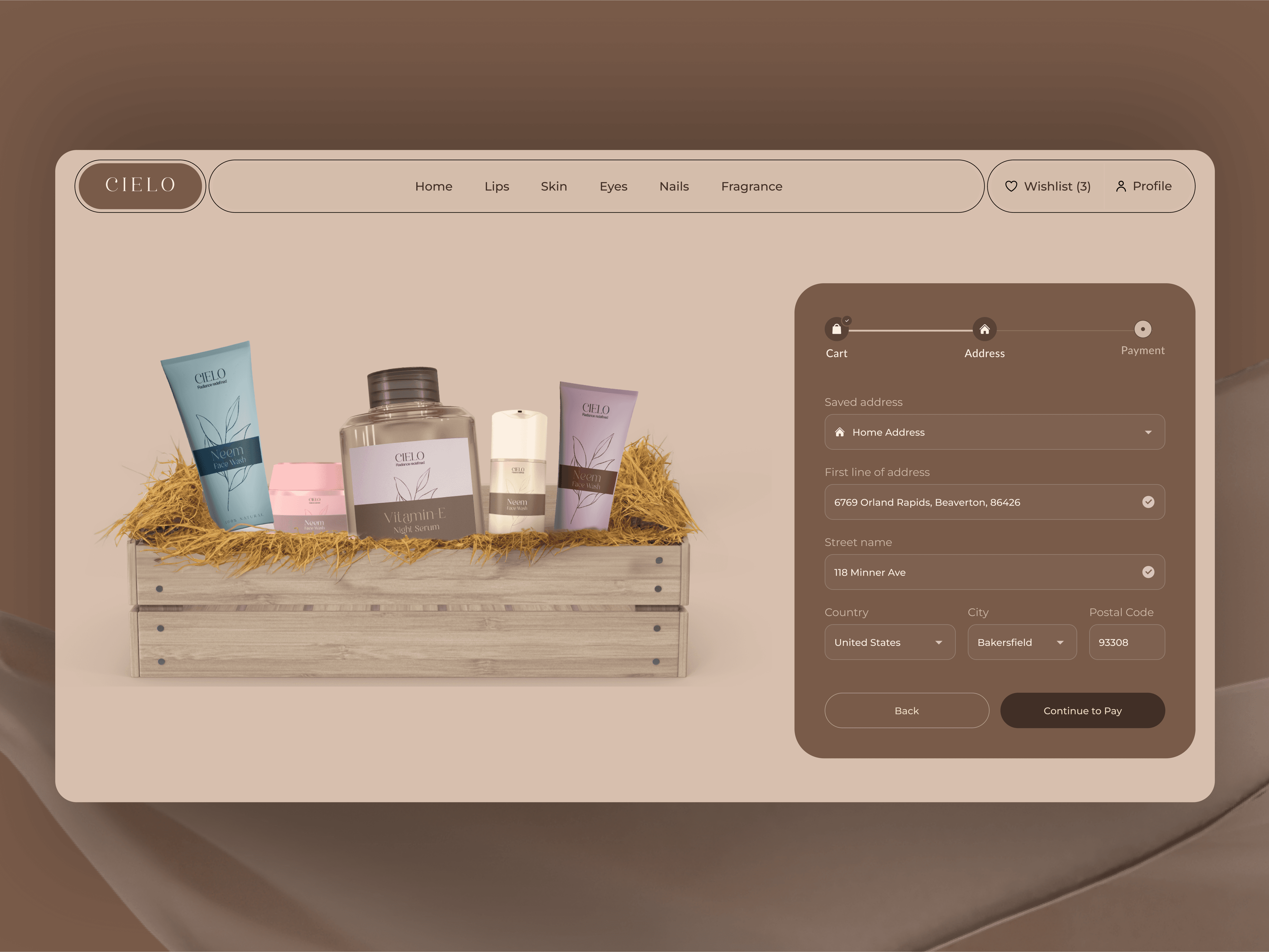
Checkout flow
Product Cards
Other personalised pages
Learnings
User-Centric Design: Improved in understanding user needs through research and direct client interactions.
Problem-Solving: Developed creative solutions to simplify complex workflows for SMEs and MSMEs.
Collaboration: Gained experience working with a team to deliver cohesive and efficient designs.
End-to-End Process: Enhanced skills in both UX research and UI design.
Client Communication: Learned to effectively integrate client feedback into the design process.
Professionalism: Balanced project demands while adhering to NDA constraints.
View More Work...
Environmental Technology
Sharing reports was difficult — many relied on screenshots. Filters and performance tracking were useful, but comparison features were missing. Users wanted faster access, clearer layouts, and better support for key decision-making. Users found role-based views helpful for staying focused without switching tabs. Uploading data was slow and often needed manual error fixes.


E-Learning
BookNest
Healthcare
HealthMate